
Presentation Zen
DESIGN TIPS
(1) Keep it simple
Presentation software was designed as a convenient way to display graphical information that supports the speaker and supplements the presentation. The slides themselves were never meant to be the star of the show (the star, of course, is your audience and your connection to them). People came to hear you and be moved or informed (or both) by you and your message. Don’t let your message and your ability to tell a story get derailed by slides that are unnecessarily complicated, busy, or full of what Edward Tufte calls chart junk. Nothing in your slide should be superfluous.
Your slides should have plenty of empty space (sometimes called white space or negative space.) Do not feel compelled to fill empty areas on your slide with your logo or other unnecessary graphics or text boxes that do not contribute to better understanding. The less clutter you have on your slide, the more powerful your visual message will become. In the words of Edward Tufte, "What can be done with fewer is done in vain with more."

(2) Make it visual

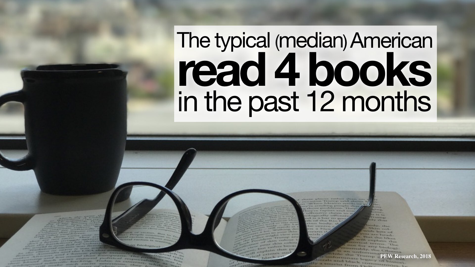
According to the Picture Superiority Effect, pictures are remembered better than words—especially when people are casually exposed to the information and the exposure is for a very limited time. When information recall is measured just after exposure to a series of pictures or a series of words, the recall for pictures and words is about equal. The picture superiority effect, however, applies when the time after exposure is more than 30 seconds, according to research cited in Universal Principles of Design (Rockport Publishers). “Use the picture superiority effect to improve the recognition and recall of key information. Use pictures and words together, and ensure that they reinforce the same information for optimal effect,” say authors Lidwell, Holden, and Butler. The effect is strongest when the pictures represent common, concrete things.
Keep this effect in mind when designing slides with images and text that support a narrative. Visual imagery is a powerful mnemonic tool that helps learning and increases retention compared to, say, witnessing someone read words off a screen.
Where can I get images?
There are many great subscription resources such as Adobe Stock, Shutterstock, iStockphoto, Storyblocks, and many others. And Canva is a remarkable design resource.
Here are some free sources that offer good images.
Pexels.com (also has video, popular with my students)
Pixabay.com (also has video)
Below are a few sample slides from my past presentations that appear in the Presentation Zen book.

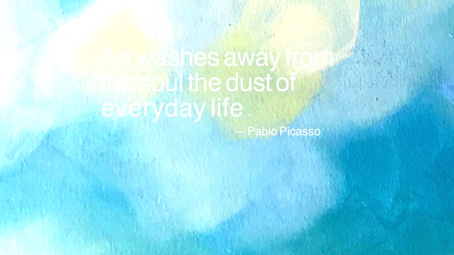
Sample slide with quote over full-bleed photo.

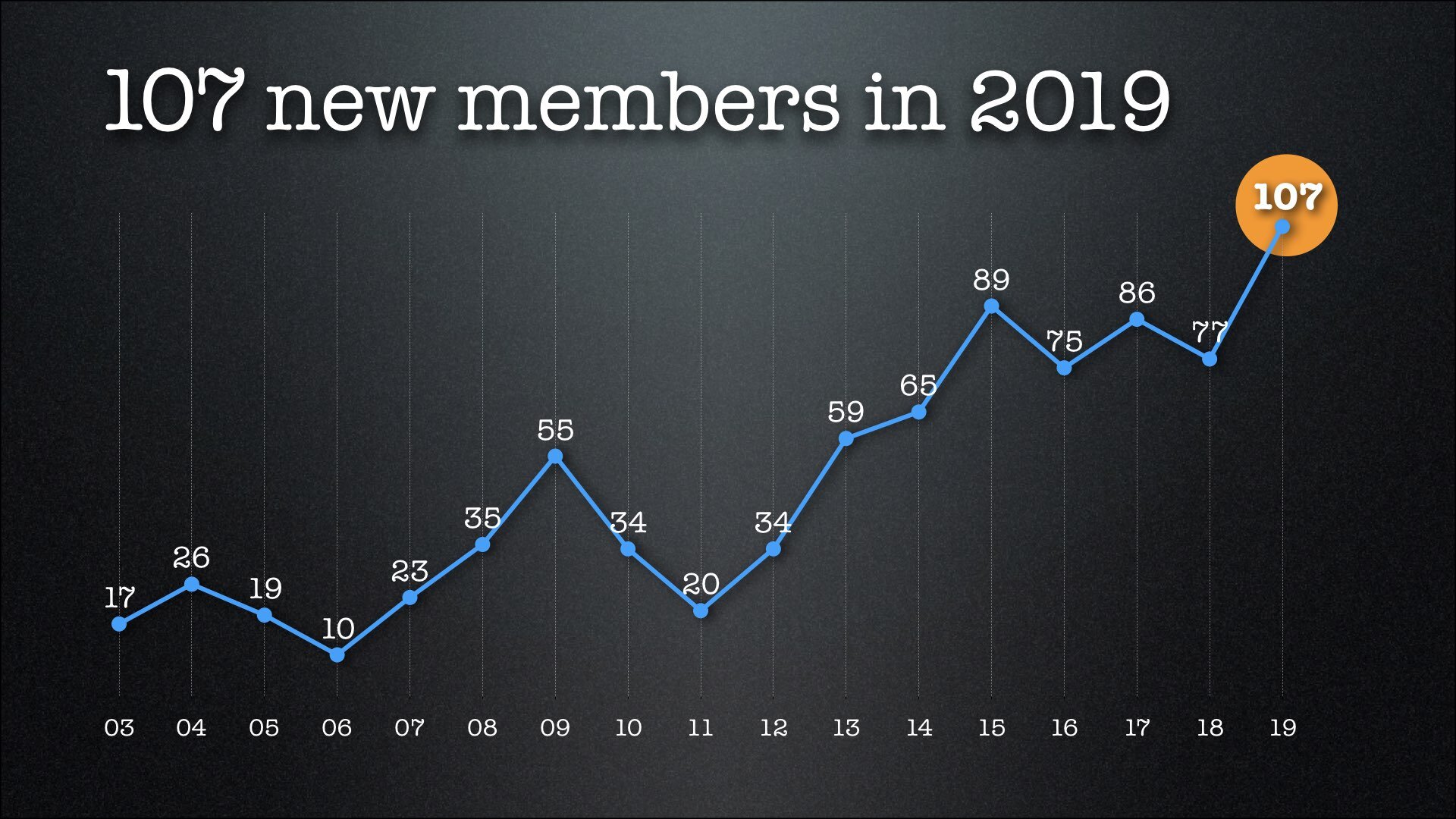
Charts are visuals too.
Text and imagery together can tell a story.

Visuals can reinforce your point.

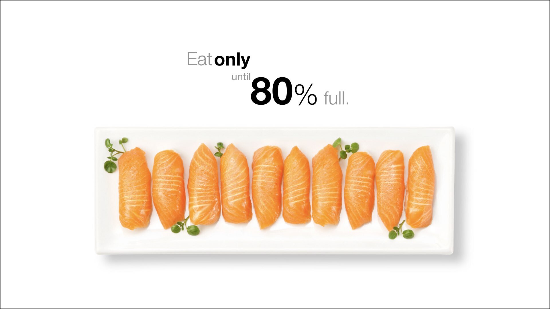
Image and simple data together.

Visual from a economics keynote address.

Sample bilingual quote slide.

Sample bilingual quote slide.
(3) Do not create “slideuments”

Slides are slides. Documents are documents. They aren't the same thing. Attempts to merge them result in what I call the "slideument" (slide + document = slideument). Much death-by-Powerpoint suffering could be eliminated if presenters clearly separated the two in their own minds before they even started planning their talks.
Projected slides should be as visual as possible and support our point quickly, efficiently and powerfully. The verbal content, the verbal proof, evidence, and appeal/emotion comes mostly from our spoken word. Boring an audience with bullet point after bullet point is of little benefit to to your audience. The best slides may have no text at all. This may sound insane given the dependency of text slides today, but the best PowerPoint slides will be virtually meaningless with out the narration (that is you). Remember, the slides are meant to support the narration of the speaker, not make the speaker superfluous. Many people often say something like this: “Sorry I missed your presentation. I hear it was great. Can you just send me your PowerPoint slides?” But if they are good slides, they will be of little use without you. Instead of a copy of your PowerPoint slides, it is far better to prepare a written document which highlights your content from the presentation and expands on that content. Or make a video of your presentation and post the link.

BEFORE: A slideument.

AFTER: More visual, simpler.

BEFORE: A bulleted list…

AFTER: A more visual way to display the same six points.
(4) Aim for a high Signal-to-Noise ratio

The Signal-to-Noise ratio (SNR) is a principle borrowed from fields such as radio communications and electronic communication in general, but the principle itself is applicable to design and communication problems in virtually any field. From the book Universal Principles of Design, the SNR is “the ratio of relevant to irrelevant information in a display. The highest possible signal-to-noise ratio is desirable in design.”
Ensuring the highest possible signal-to-noise ratio means designing slides clearly with as little degradation to the message as possible. Degradation to the message can occur in many ways such as with the selection of inappropriate charts, using ambiguous labels and icons, or unnecessarily emphasizing items such as lines, shapes and symbols, etc. that do not play a key role in support of the message. In other words, if the item can be removed without compromising function, then strong consideration should be given to minimizing the element or removing it all together. For example, lines in grids or tables can often be made quite thin, lightened, or even removed. And footers and logos, etc. can usually be removed with good results In a nutshell, the authors put it this way: “Every element in a design should be expressed to the extent necessary, but not beyond the extent necessary.”
Below are some simple before/after examples of slides made a bit less noisy.

BEFORE (1)

AFTER (1)

BEFORE (2)
AFTER (2)

BEFORE (3)

AFTER (3)

BEFORE (4)

AFTER (4)
(5) Design for the back of the room

The problem with most presentation visuals is not that text in the slide is too big, but that it is way too small. Make the text large enough for the person in the very last row to see easily. Design for the back of the room. Fill the screen and create design elements that are easy to see. In the book Slide:ology (O'Reilly Media) by my friend Nancy Duarte, she says that good slides are similar to signs along the side of the road in the sense that the audience should be able to get the meaning in a very short amount of time.
“Presentations are a 'glance media' — more closely related to billboards than other media.... Ask yourself whether your message can be processed effectively within three seconds.”
— Nancy Duarte
Like a billboard, the elements in a slide, including type, must be large enough to be seen and understood instantly from a distance. There is no excuse for making people squint. Make it big and make it clear. This principle also applies for your videos or online presentations which are often viewed on small screens.

Make it easy to see from the back of the room.

BEFORE (1) Obviously, this would be ridiculously small.

AFTER (1) Much greater impact and easier for the audience.

Like a sign on the highway, elements must be easy to see.

BEFORE (2) This is “good enough” many people say.

AFTER (2) But much greater impact and clarity at full screen.
(6) Make images large, often fullscreen.
This is related to number 5 above. It all depends on the presentation context, but generally try designing your slide so that it features an image fullscreen (or full bleed) and then place your text on top in an area with good empty space. It’s often better to have one large, powerful image rather than several smaller images on the same slide. Even if your smaller images were of good quality, their small size will make them harder to see and reduce their impact. There are times, however, when it’s appropriate to have two (sometimes more, if necessary) images on the slide at the same time. For example, if you are comparing “Before/After” or “Then/Now” images such as the samples below, a side-by-side approach may work well. Just make certain that the images are displayed as large as possible so that they are easy to see.

BEFORE (1) Small images make slide less impactful.

AFTER (1) One image, fullscreen with type overlay.

Side-by-side example (images: NASA)

Side-by-side example (images: NASA)

Side-by-side example (images: NASA)
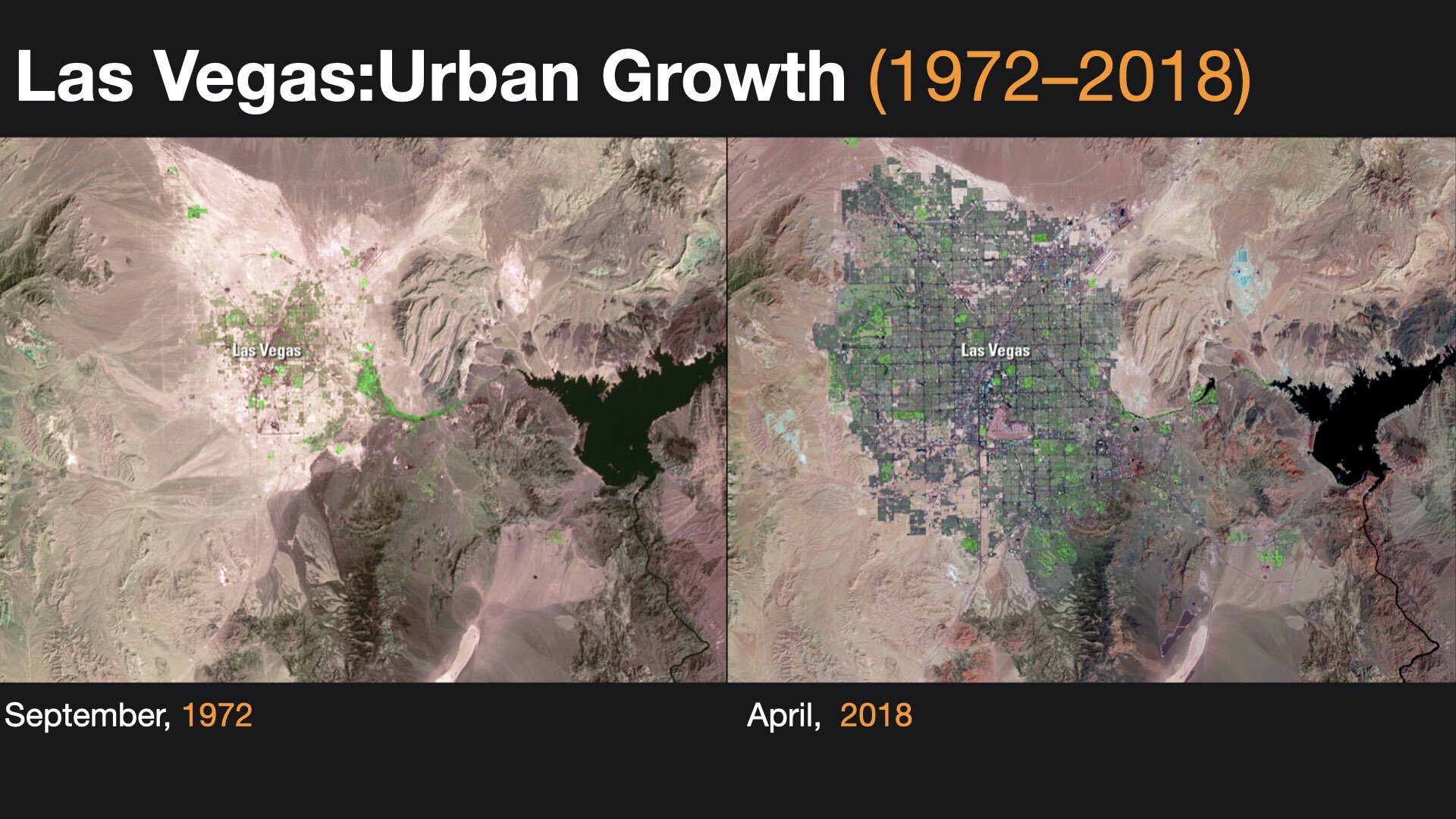
Side-by-side example (images: NASA)
(7) Use the principle of Contrast to highlight and make visuals clear.

We are all wired to notice differences. We are not conscious of it, but we are scanning and looking for similarities and differences all the time. Contrast is what we notice, and it’s what gives a design its energy. So you should make elements that are not the same clearly different. You can achieve contrast in many ways—for example, through the manipulation of space (near and far, empty and filled), through color choices (dark and light, cool and warm), by typeface selection (serif and sans serif, bold and narrow), by the positioning of elements (top and bottom, isolated and grouped), and so on.
Every good design has a strong and clear focal point, so it helps to have clear contrast among elements, with one element being clearly dominant. If all items in a design are of equal or similar weight with weak contrast and nothing clearly dominant, it is difficult for the viewer to know where to look. Designs with strong contrast attract interest and help the viewer make sense of the visual. Weak contrast may make a visual message boring, but also hard to see and even confusing. Below are some simple before/after examples.
BEFORE (1)

AFTER (1)

BEFORE (2)

AFTER (2)

BEFORE (3)

AFTER (3)

BEFORE (4)

AFTER (4)
(8) Use the principle of Rule of Thirds to create balance and interest.

The Rule of Thirds, which is derived from the Golden Mean, is a basic design technique that can help you add balance (symmetrical or asymmetrical), beauty, and a higher aesthetic quality to your visuals. The rule of thirds is a basic technique that photographers learn for framing their shots. Subjects placed exactly in the middle can often make for an uninteresting photo (but not always). A viewfinder (or a slide or screen in our case) can be divided by lines—real or just imagined—so that you have four intersecting lines or crossing points and nine boxes that resemble a tic-tac-toe board. These four crossing points (also called “power points,” if you can believe it) are areas you might place your main subject, rather than in the center. Below are some sample slides with the grid on top (the grid does not show when the slides are played or exported).


(9) Use clear charts & graphs.
The kinds of visual displays of quantitative information you use in a presentation depend on your unique objectives. The only rule concerning the display of data—besides telling the truth—is simplicity. You can achieve simplicity in the design of effective charts, graphs, and tables by remembering three fundamental principles: restrain, reduce, emphasize.
Restrain
The hardest thing to do is edit yourself—to stop adding more. Most presenters include too much information in a display. Charts and graphs can be hard enough for the audience to see, so we should be careful not to make it more difficult for them by adding superfluous elements that do more harm than good. Clutter such as footers, logos, and decorative items create noise. Your job is to include as much as necessary, but no more. Success fundamentally depends on making good decisions about what to leave in and what to leave out, and this requires you to exercise restraint.
Reduce
Many quantitative displays can become more effective if you simply reduce the nonessential. So how do you decide what to remove? By reminding yourself what is important. Ask yourself several questions:
• What will the display really show your audience?
• How will it help them to see your point?
• What is the essence of the point this particular chart helps to make?
• Are any elements in this slide nonessential?
Emphasize
Where do your want the eyes to go on your chart first? What is it that you think is most important? What is the most salient point to you? Make this clear to the audience. There are two simple ways to make charts and graphs easier to understand by emphasizing what is important. The first is to use contrast—such as color—to highlight the part you want people to focus on. The second method is to write a declarative statement rather than a title at the top of the slide. For example: “Reported cases of influenza decreased by 17% in 2021” instantly suggests the meaning of the chart and is much preferable to something like “Reported cases of influenza (2021).”
Sample before/after slides below.

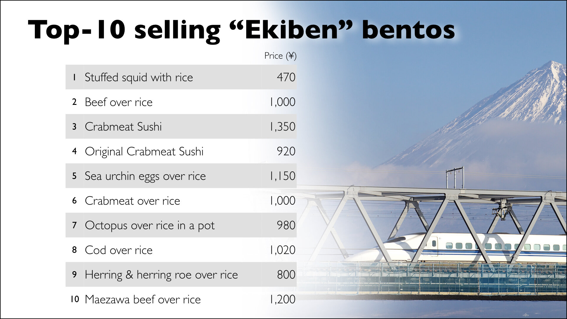
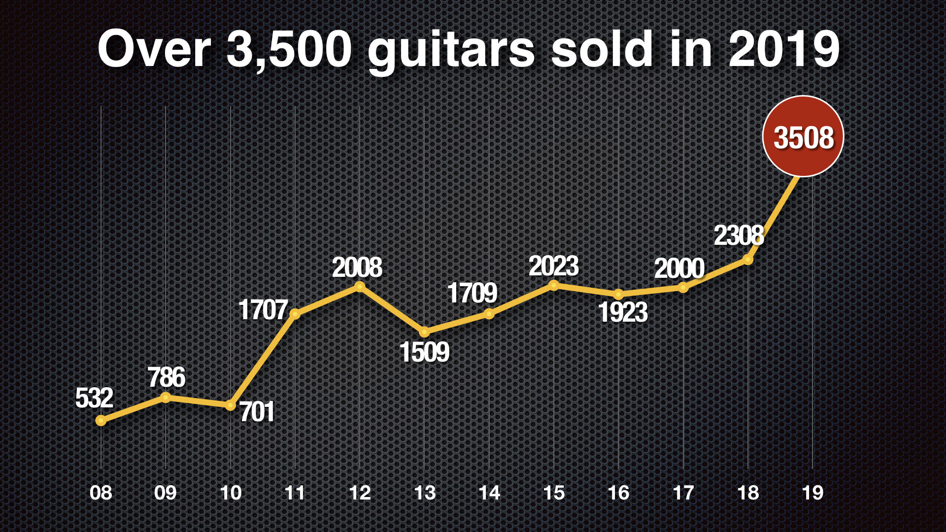
BEFORE (1)

AFTER (1)

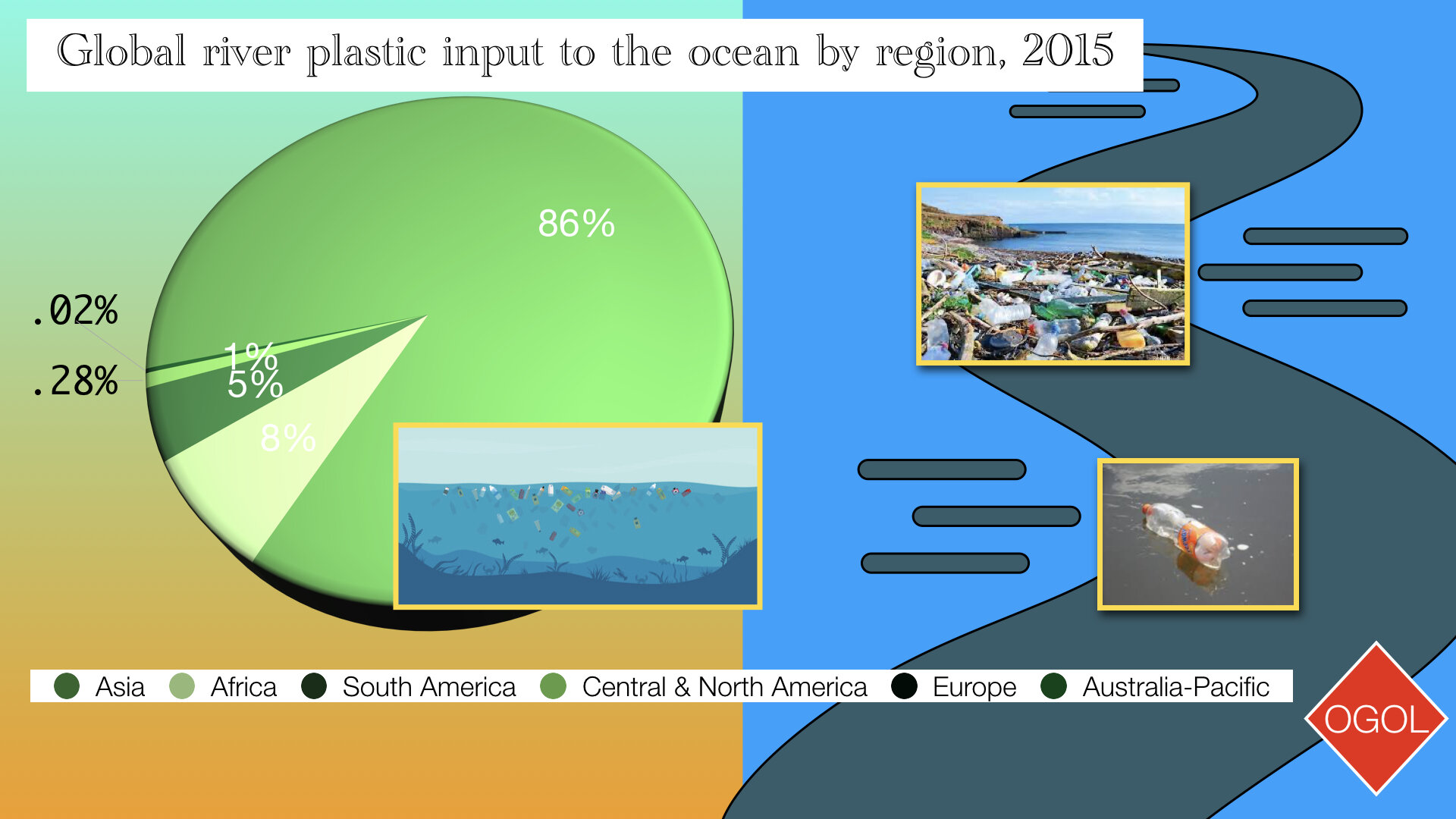
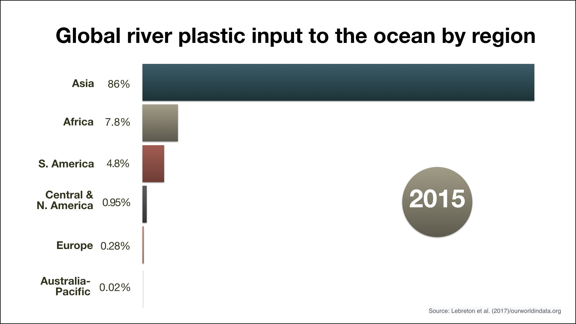
BEFORE (2)

AFTER (2)

BEFORE (3)
AFTER (3)

BEFORE (4)
AFTER (4)
BEFORE (5)
AFTER (5)

Before (6)

AFTER (6)
(10) Choose your fonts well.
Keep it simple and make them large. One of the fundamental ways to differentiate typefaces is in terms of whether the letters and other marks have serifs or not. Serifs are the small details at the ends of strokes. Sans means without, so a sans serif typeface is one without those small details at the end of strokes. Generally—and this is a big generalization—a sans serif typeface is best for projected slides, but at large sizes, even a serif typeface such as Garamond is legible. And a slab serif typeface such as Rockwell, which has heavier block-like serifs, can make for an excellent typeface. Still, sans serif is often the preferred typeface style for billboards and a great deal of the signage we see around us. The main thing is that you should create type that is large enough to be easily understood in an instant. The samples below are in grey and black. The second row below are bold versions of the typeface.

When you increase the size of the type in your slide, the space between letters can seem too great, but you can decrease the character spacing in your software, thereby making the type a bit tighter. The space between lines of type can seem too great as well at large sizes, but again, this is easily corrected in the text editing features of your software. Below are a few examples of serif, and sans serif.

SERIF

SANS SERIF

SERIF
SANS SERIF

SERIF

SANS SERIF

SERIF

SLAB SERIF
(11) Use short video clips
Use video and audio when appropriate. Using video clips to show concrete examples promotes active cognitive processing, which is the natural way people learn. You can use video clips within slide ware without ever leaving the application. Using a video clip not only will illustrate your point better, it will also serve as a change of pace thereby increasing the interest of your audience. You can use audio clips (such as interviews) as well. Something to avoid, however, is cheesy sound effects that are included in PowerPoint (such as the sound of a horn or applause when transitioning slides). Make sure to embed your video in your slide, full screen at 1080p if possible. You can even play videos that have no narration where you are the narrator in realtime. Sometimes, presenters use short video clips that serve as B-roll which is in sync to the speaker’s content. For example, in the TED talk below, Louie Schwartzberg speaks mostly as remarkable video images play on the screen above him. This is something you could do in the classroom or at the conference or other event where you’ve been asked to speak.
(12) Use colors with purpose, choose just a few.
![AdobeStock_247372577 [Converted].jpg](https://images.squarespace-cdn.com/content/v1/60657565527143387b2eeda5/1624024551596-23FA84LIZEVENZ4GXAXW/AdobeStock_247372577+%5BConverted%5D.jpg)
Color evokes feelings. Color is emotional. The right color can help persuade and motivate. Studies show that color usage can increase interest and improve learning comprehension and retention. You do not need to be an expert in color theory, but it’s good to know at least a bit on the subject. Colors can be divided into two general categories: Cool (such as blue and green) and Warm (such as orange and red). Cool colors work best for backgrounds as they appear to recede away from us into the background. Warm colors generally work best for objects in the foreground (such as text) because they appear to be coming at us. If you will be presenting in a dark room (such as a large hall), then a dark background (dark blue, grey, etc.) with white or light text will work fine. But if you plan to keep most of the lights on (which is highly advisable) then a white background with black or dark text works much better. In rooms with a good deal of ambient light, a screen image with a dark background and light text tends to washout, but dark text on a light background will maintain its visual intensity a bit better. Usually it is best to choose only a few colors and stick with those throughout the design for a unified, harmonious feel. Color is evocative, but it is not for decoration and instead should be used to get attention, highlight, and guide the eye of the viewer and make meaning easier. The two sample slide deck templates below use simple, consistent color treatments.


(13) Limit the use of animation and transition effects.
Use object builds, effects, and slide transitions judiciously. Movement is the thing the brain noticed the most, so we want to use movement on our screen with caution. When an element moves or appears on the screen, the audience will notice it. Sometimes that is a very good thing, but too much animation and slide transitions can become distracting and tiresome. Object builds (also called animations), such as bullet points, should not be animated on every slide. Some animation is a good thing, but stick to the most subtle. A simple “Wipe Left-to-Right” (from the “Animations” menu) is good for a bullet point now and then, but a “Move” or “Fly” for example is too tedious and slow. Listeners will get bored very quickly if they are asked to endure slide after slide of animation. For transitions between slides, use no more than two-three different types of transition effects and do not place transition effects between most slides.

Some subtle animation and transition effects can help the audience. But do not over do it. The more you use an effect, the less effective if will be. A little goes a long way.
(14) Spend time in the slide sorter
According to the Segmenting Principle of multimedia learning theory, people comprehend better when information is presented in small chunks or segments. By getting out of the Slide View and into the Slide Sorter view, you can see how the logical flow of your presentation is progressing. In this view you may decide to break up one slide into, say, two-three slides so that your presentation has a more natural and logical flow or process. In this view you will be able to capture more of the gestalt of your entire presentation from the point of view of your audience. You will be able to notice more extraneous pieces of visual data that can be removed to increase visual clarity and improve communication.
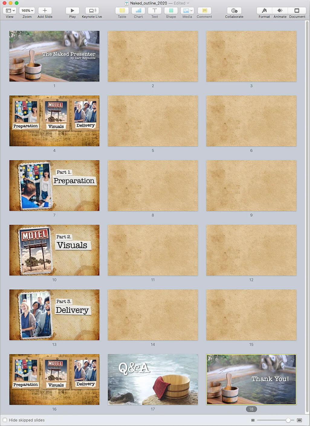
The slide sorter view with the basic structure of the presentation (about the art of presentation) in place. As you build your visuals (based on your notes and sketches), it is a good idea to come back to the slide sorter view to get 35,000-ft view of the visual flow and pace of your presentation.
Bonus tip
Below is a video I made recently where I discuss the idea of “being one with the visuals” and showing you an example of presenting in a more cinematic way with a very large screen.
Get the best-selling book on presentations, now in its 3rd edition.
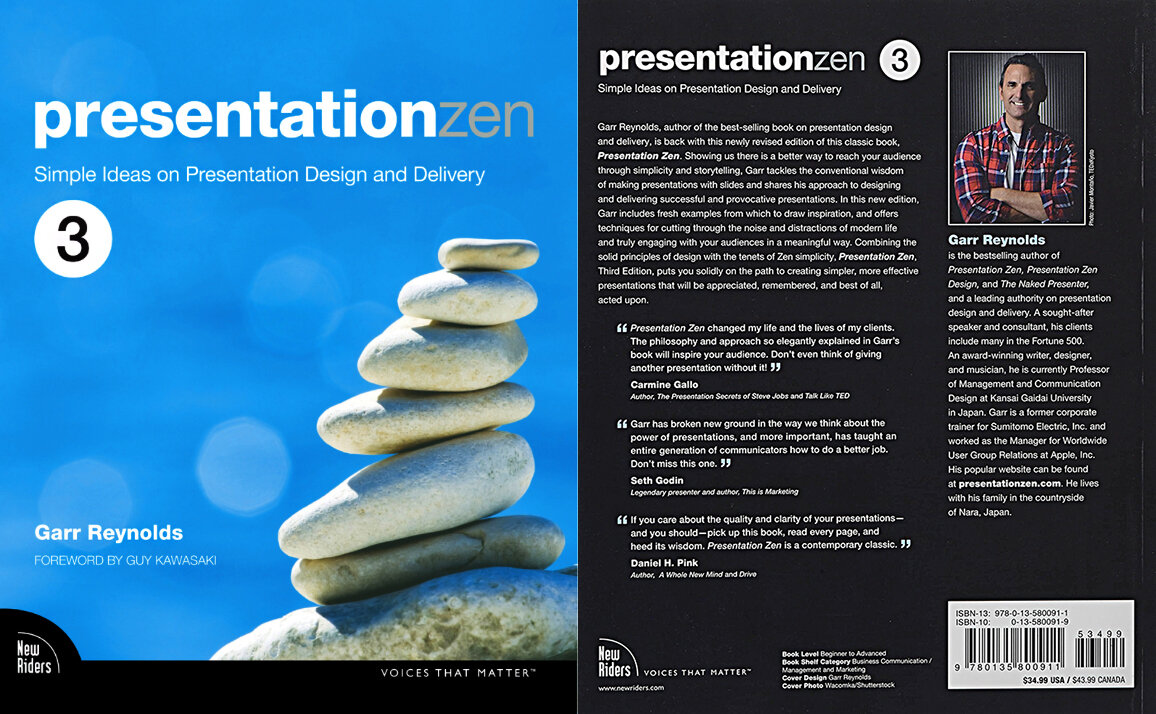
The third edition of Presentation Zen has many more in-depth explanations of practical design principles and concepts with loads of examples. The best-selling, award-winning book takes you through the preparation and design process with a discussion on best practices for remarkable delivery in the final part of the book.